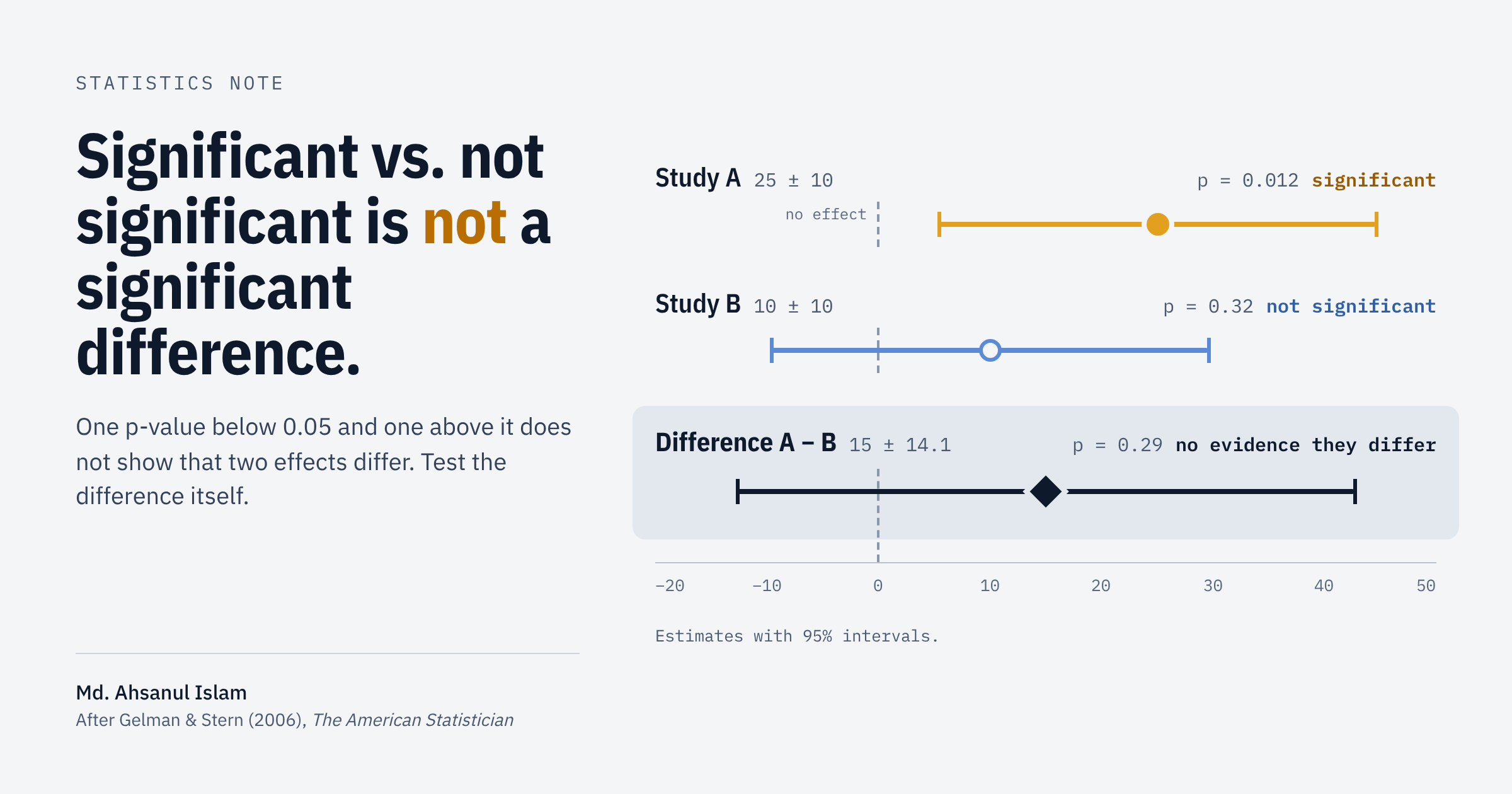
A training program improves test scores for men (\(p = 0.009\)) but not for women (\(p = 0.23\)). A drug lowers blood pressure in one trial and “fails” in another. In a regression, TV advertising predicts sales but radio advertising does not. Each of these sentences invites the same conclusion, which is, the two things behave differently.
That conclusion does not follow. It is one of the most common errors in applied statistics, and Gelman and Stern (2006) gave it a memorable name in The American Statistician: the difference between “significant” and “not significant” is not itself statistically significant. A free copy of the paper is on Andrew Gelman’s website.
This post walks through why the comparison of p-values fails, how to test the difference correctly, and how to set up a regression so that the contrast you care about appears directly in the output.
The trap
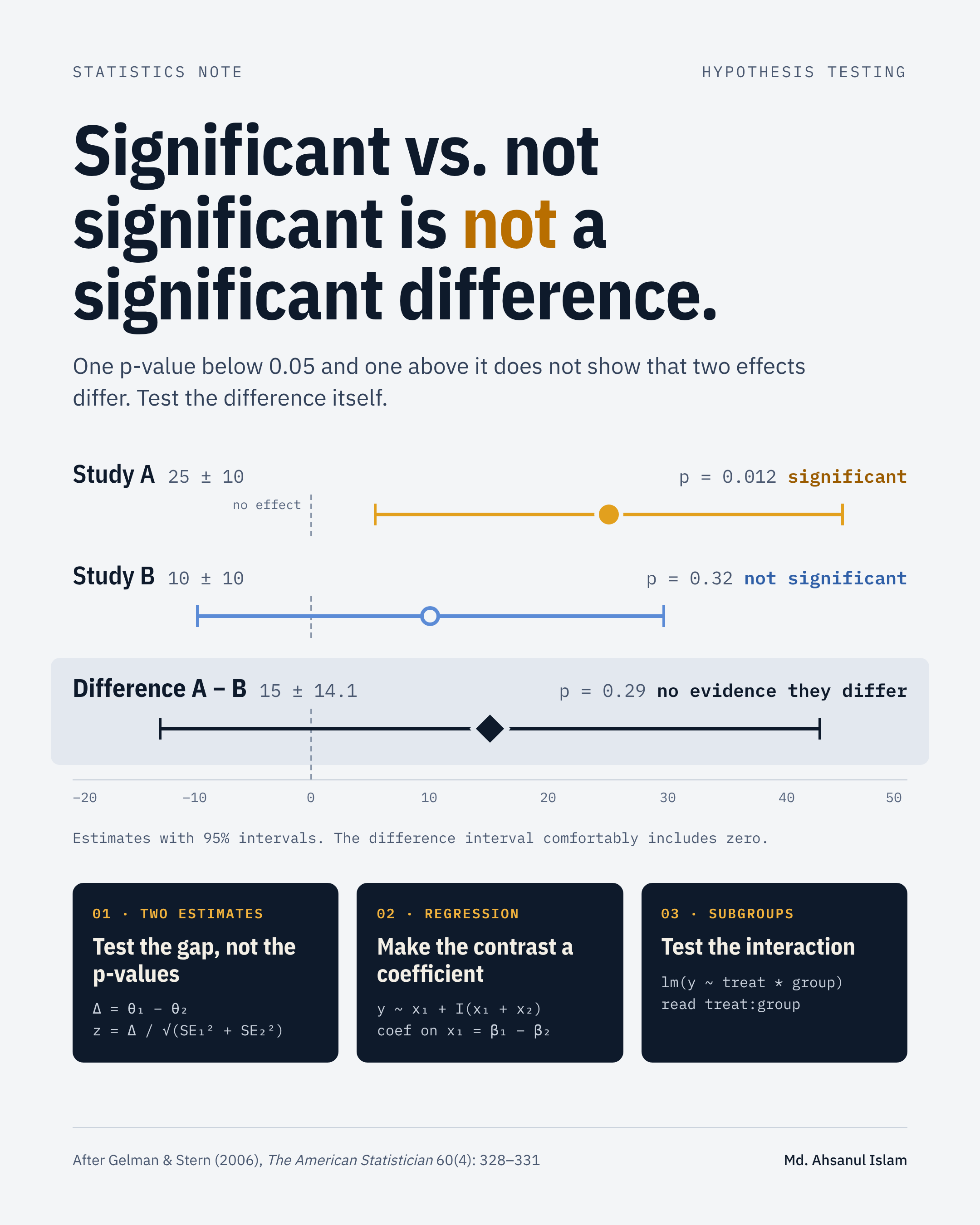
Suppose two independent studies estimate the same kind of effect.
| Study | Estimate | Standard error | \(z\) |
\(p\) |
|---|---|---|---|---|
| A | 25 | 10 | 2.5 | 0.012 |
| B | 10 | 10 | 1.0 | 0.317 |
Study A meets the 5% significance level, but Study B does not. It is tempting to write “the effect was found in A but not in B.” But look at the quantity that the sentence is actually about - “the difference between the two effects.”
Because the studies are independent, the combined variance can be calculated as:
The difference is about one standard error from zero. The data are entirely consistent with A and B having the same true effect. The gap between “significant” and “not significant” was produced by sampling noise pushing two similar estimates onto opposite sides of an arbitrary threshold.
Why comparing p-values fails
A p-value attempts to answer, is this estimate distinguishable from zero? Notice that, it says nothing about whether it is distinguishable from another estimate.
Three things make this especially misleading:
- It is important to remember that a p-value of 0.04 and one of 0.06 are nearly identical pieces of evidence. Labeling one “an effect” and the other “no effect” turns a tiny change in data into a qualitative difference in conclusion.
- “Not significant” is not “zero.” Study B’s estimate of 10 is still positive and its interval, roughly
\([-10, 30]\), comfortably includes 25. Failing to reject\(H_0: \theta_B = 0\)is not evidence that\(\theta_B = 0\). - Equal p-values do not mean equal effects, just as unequal p-values do not mean unequal effects. Gelman and Stern (2006) provided an example. A study with estimate
\(2.5 \pm 1.0\)has exactly the same z-score (2.5) as Study A, yet its estimate is far closer to Study B’s.
A real-world example: Magnetic fields and chick brains
In the 1980s there was public concern that low-frequency electric and magnetic fields, the kind found around power lines and household wiring, might affect health. Blackman et al. (1988) ran a series of laboratory experiments on chick brain tissue to look for a biological effect. At each of 38 settings between 1 Hz and 510 Hz they ran a randomized experiment, exposing tissue either to the field or to no field, and measured how much calcium the tissue released. The result at each frequency is a treatment effect. So an effect of 0.10 means 10% more calcium released than in the unexposed control.
Gelman and Stern (2006) use this study because it multiplies the problem. With 38 estimates there are 703 possible pairs, and every “significant at this frequency, not at that one” is a chance to read noise as a pattern.
What the original chart did
The researchers summarized their results by statistical significance. Results more than 2.3 standard errors from zero were shaded as highly significant, results between 2.0 and 2.3 as moderately significant, and so on. From that picture they proposed that one biological process was at work at 255, 285 and 315 Hz, where effects were highly significant, and another at 135 and 225 Hz, where they were only moderately significant.
Panel A below recreates that way of looking. Panel B plots exactly the same numbers, but as estimates with their standard errors.
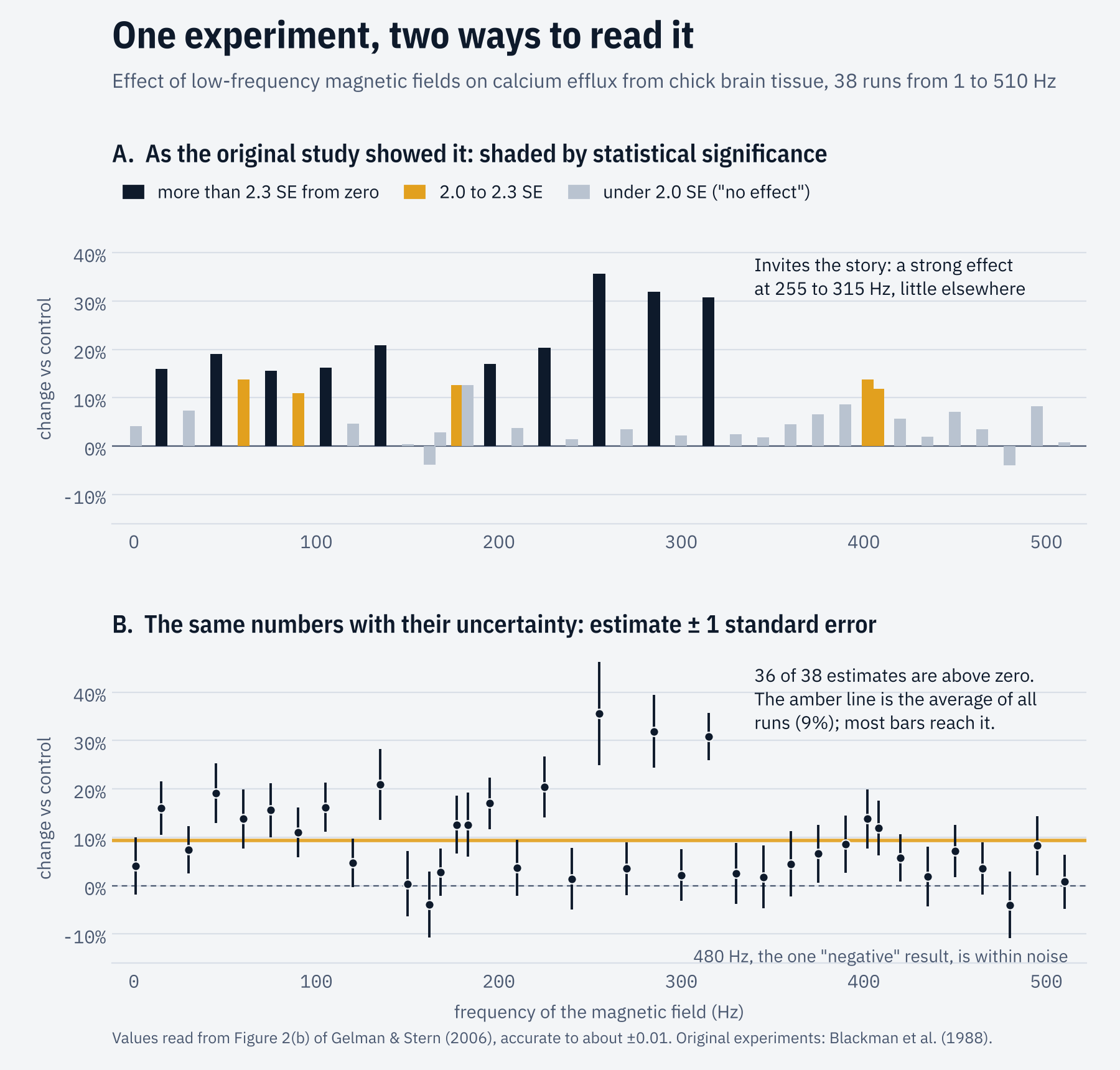
Panel B tells a simpler story. The effect is almost always positive (36 of the 38 estimates are above zero) and typically not far from 10%. The features that look dramatic in panel A, such as the negative estimate at 480 Hz or the pair of significant results at 405 Hz, sit comfortably inside the error bars in panel B. As Gelman and Stern put it, they “could be explained by sampling variability and do not necessarily represent real features of the underlying parameters.”
The shading in panel A is not wrong arithmetic. Each bar’s label is a correct statement about that one bar. The error is in what our typical brain does next. It compares dark bars with light bars and concludes that the frequencies differ, without that comparison ever being tested.
Testing the differences directly
“Does the effect depend on frequency?” is a question about differences, so the differences are what we test. Here are two neighbouring pairs, each shown with 95% intervals and the interval for their difference.
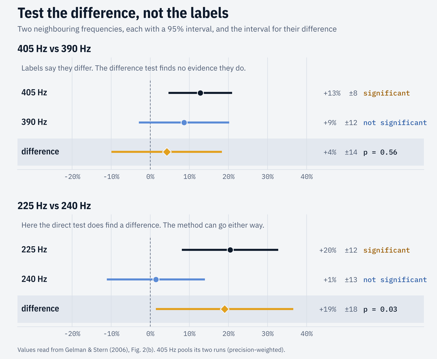
The calculation is the same one as for Studies A and B earlier. The experiments at different frequencies were separate, so the variances add.
Note: 405 Hz was run twice. Rather than pick one run, we combine both. Each run is weighted by its precision, \(w_i = 1/\text{SE}_i^2\), which gives the pooled estimate and its standard error:
emf <- read.csv("emf-blackman1988.csv")

combine <- function(f) {
  d <- emf[emf$frequency_hz == f, ]
  w <- 1 / d$se^2
  c(estimate = sum(w * d$estimate) / sum(w), se = sqrt(1 / sum(w)))
}

compare <- function(f1, f2) {
  a <- combine(f1)
  b <- combine(f2)
  diff <- a[["estimate"]] - b[["estimate"]]
  se   <- sqrt(a[["se"]]^2 + b[["se"]]^2)
  z    <- diff / se
  round(c(z_first = a[["estimate"]] / a[["se"]], z_second = b[["estimate"]] / b[["se"]],
          difference = diff, se = se, z = z, p = 2 * pnorm(-abs(z))), 3)
}
compare(405, 390)
   z_first   z_second difference         se          z          p
     3.070      1.458      0.042      0.072      0.580      0.562
Direct comparison shows 405 Hz is clearly significant (\(z \approx 3.1\)) and 390 Hz is not (\(z \approx 1.5\)). Yet the two estimates differ by only about 4 percentage points, with a standard error of about 7 (\(p = 0.56\)). There is no evidence that the field acts differently at these two frequencies.
compare(225, 240)
   z_first   z_second difference         se          z          p
     3.238      0.219      0.190      0.090      2.116      0.034
At 225 Hz versus 240 Hz the difference test does reach \(p = 0.03\).
Testing all 38 at once
Comparing pairs one at a time quickly turns into a multiple-comparisons problem. The cleaner question can be, are these 38 estimates consistent with one common effect? Cochran’s \(Q\) statistic can help here. It measures how far each estimate sits from the precision-weighted average \(\bar\theta\), in units of its own standard error:
If every frequency had the same true effect, \(Q\) would follow a chi-squared distribution with \(k - 1\) degrees of freedom.
heterogeneity <- function(d) {
  w    <- 1 / d$se^2
  pool <- sum(w * d$estimate) / sum(w)
  Q    <- sum(w * (d$estimate - pool)^2)
  round(c(runs = nrow(d), common_effect = pool, Q = Q, df = nrow(d) - 1,
          p = pchisq(Q, df = nrow(d) - 1, lower.tail = FALSE)), 4)
}

heterogeneity(emf)
         runs common_effect             Q            df             p
      38.0000        0.0939       77.9965       37.0000        0.0001
Across all 38 runs, \(Q\) is large and the effect does seem to vary with frequency.
heterogeneity(emf[!emf$frequency_hz %in% c(255, 285, 315), ])
         runs common_effect             Q            df             p
      35.0000        0.0793       41.6728       34.0000        0.1716
Most of that variation comes from the three runs at 255, 285 and 315 Hz. After removing these, the remaining 35 are consistent with a single common effect of about 8% (\(p = 0.17\)). That second test was suggested by the data, so treat it as exploratory, but it points to a simpler picture than the one built from significance labels.
There may be something real in the 255 to 315 Hz range. The finer structure of separate processes at 135 and 225 Hz, something special at 405 Hz and a reversal at 480 Hz has no support once the differences are tested.
A note on the data. Gelman and Stern show these results only as a graph (their Figure 2b). The values in emf-blackman1988.csv were read from that graph with an image-processing script using Claude and are accurate to about ±0.01. That is good enough to illustrate the method, not to reanalyse the biology.
Suggested Good Practice: Test the difference directly
Whenever the conclusion you want to state is a comparison, the comparison should be tested directly. This includes -
- Two treatments or two doses
- The same treatment in two subgroups (men vs women, urban vs rural)
- Two coefficients in one regression
- Two experimental conditions
- A new study vs an earlier published finding
Two independent estimates
For estimates from separate samples,
This is what we did above and usually taught in introductory statistics courses to compare between means that come from independent samples.
Two coefficients from the same model
Coefficients estimated from the same data are usually correlated, so the covariance term matters:
Ignoring the covariance can make the standard error too large or too small, depending on its sign. All three pieces sit in the model’s variance-covariance matrix.
Doing it in R
Here is a simulated marketing example. Sales are regressed on TV and radio advertising spend (in thousand BDT), and the two spends are correlated, as they usually are in practice.
set.seed(1093)
n     <- 120
tv    <- rnorm(n, mean = 10, sd = 3)             # TV spend
radio <- 0.5 * tv + rnorm(n, mean = 5, sd = 2.5) # radio spend, correlated with TV
sales <- 20 + 0.9 * tv + 0.5 * radio + rnorm(n, sd = 6)

fit <- lm(sales ~ tv + radio)
round(summary(fit)$coefficients, 3)
            Estimate Std. Error t value Pr(>|t|)
(Intercept)   25.014      2.645   9.457    0.000
tv             0.600      0.205   2.928    0.004
radio          0.230      0.257   0.894    0.373
TV is “significant,” radio is not. The tempting headline is “TV advertising works and radio does not, so move the budget to TV.” Before writing that, test the contrast.
Option 1: Use the variance-covariance matrix
b <- coef(fit)
V <- vcov(fit)

diff    <- b["tv"] - b["radio"]
se_diff <- sqrt(V["tv", "tv"] + V["radio", "radio"] - 2 * V["tv", "radio"])
t_diff  <- diff / se_diff
p_diff  <- 2 * pt(-abs(t_diff), df = fit$df.residual)

round(c(difference = unname(diff), se = se_diff,
        t = unname(t_diff), p = unname(p_diff)), 3)
difference         se          t          p
     0.370      0.388      0.952      0.343
The difference of 0.37 is less than one standard error from zero (\(p = 0.34\)). The data cannot tell TV and radio apart.
If you have the car package, car::linearHypothesis(fit, "tv = radio") gives the same test as an F statistic (here \(F = t^2\)).
car::linearHypothesis(fit, "tv = radio")
Linear hypothesis test:
tv - radio = 0

Model 1: restricted model
Model 2: sales ~ tv + radio

  Res.Df  RSS Df Sum of Sq      F Pr(>F)
1    118 4681
2    117 4645  1    35.989 0.9065  0.343
Option 2: Reparameterize the model
A neater approach is to rewrite the model so that the contrast is a coefficient. Start from
and add and subtract \(\beta_2 x_1\):
The coefficient for tv \((x_1)\) now reads as “how much more one unit of TV spend buys than one unit of radio spend?”
So if you regress \(y\) on \(x_1\) and the total \(x_1 + x_2\), the coefficient on \(x_1\) is exactly \(\beta_1 - \beta_2\), with the correct standard error and p-value printed for you.
fit2 <- lm(sales ~ tv + I(tv + radio))
round(summary(fit2)$coefficients, 3)
              Estimate Std. Error t value Pr(>|t|)
(Intercept)     25.014      2.645   9.457    0.000
tv               0.370      0.388   0.952    0.343
I(tv + radio)    0.230      0.257   0.894    0.373
The fitted values, residuals and \(R^2\) are unchanged. The general idea is to rewrite the predictors so that the comparison you care about becomes a coefficient of its own. Here we kept \(x_1\) (TV) and replaced \(x_2\) (radio) with the total \(x_1 + x_2\), and the coefficient on \(x_1\) became \(\beta_1 - \beta_2\).
Gelman and Stern (2006) suggest a close variant. The suggested to use the sum \(x_1 + x_2\) and the difference \(x_1 - x_2\) as the two predictors. Then
So the coefficient on the difference is \((\beta_1 - \beta_2)/2\). That is half the gap, but its \(t\) value and p-value are exactly the same as above (lm(sales ~ I(tv + radio) + I(tv - radio)) gives 0.185 with \(t = 0.952\)).
fit3 <- lm(sales ~ I(tv - radio) + I(tv + radio))
round(summary(fit3)$coefficients, 3)
              Estimate Std. Error t value Pr(>|t|)
(Intercept)     25.014      2.645   9.457    0.000
I(tv - radio)    0.185      0.194   0.952    0.343
I(tv + radio)    0.415      0.128   3.242    0.002
Subgroups: Test the interaction
The subgroup version is the most common in practice. In this example, a program is evaluated separately for men and women:
set.seed(108)
n <- 200
group <- factor(rep(c("Men", "Women"), each = n / 2))
treat <- rbinom(n, 1, 0.5)
score <- 50 + 4 * treat + 2 * treat * (group == "Men") + rnorm(n, sd = 10)

# The tempting (wrong) way: two separate tests
round(summary(lm(score ~ treat, subset = group == "Men"))$coefficients["treat", ], 3)
  Estimate Std. Error    t value   Pr(>|t|)
     5.004      1.875      2.669      0.009
round(summary(lm(score ~ treat, subset = group == "Women"))$coefficients["treat", ], 3)
  Estimate Std. Error    t value   Pr(>|t|)
     2.622      2.160      1.214      0.228
Seeing these results will make us believe that - “The program works for men, not for women”, since the effect is significant \((\beta_{male}=5.004, p < 0.05)\) for men but not for women \((\beta_{women}=2.622, p = 0.228)\).
The question it raises is whether the effect differs by group, and that is the interaction term:
fit3 <- lm(score ~ treat * group)
round(summary(fit3)$coefficients, 3)
                 Estimate Std. Error t value Pr(>|t|)
(Intercept)        49.541      1.374  36.054    0.000
treat               5.004      2.026   2.470    0.014
groupWomen          0.774      1.982   0.391    0.696
treat:groupWomen   -2.382      2.861  -0.833    0.406
Here, treat is the program’s effect for men only (the reference group), and groupWomen is how women and men differ when nobody gets the program. Neither of these main effects says whether the program works differently for the two groups.
That is what the interaction term treat:groupWomen measures. The interaction effect can be read as an algebraic operation of the main effects from the subgroup models:
So the interaction is the “men vs women” claim itself, with its own standard error and p-value.
The interaction estimate, \(-2.38\) with \(p = 0.41\) shows that there is no evidence that the program works differently for women. Reporting a gender difference here would be misinterpretation
The same logic applies in ANOVA and other statistical experiments. To claim differences between condition A and condition B, use a planned contrast or a post-hoc comparison between A and B, not that A differed from control and B did not.
Closing thought
Statistical significance is a statement about one estimate relative to zero (or a constant). Scientific claims are usually statements about how things compare. When the claim is a comparison, the evidence has to be a comparison too.
References
Blackman, C. F., Benane, S. G., Elliott, D. J., House, D. E., & Pollock, M. M. (1988). Influence of electromagnetic fields on the efflux of calcium ions from brain tissue in vitro: A three-model analysis consistent with the frequency response up to 510 Hz. Bioelectromagnetics, 9, 215–227.
Gelman, A., & Stern, H. (2006). The difference between “significant” and “not significant” is not itself statistically significant. The American Statistician, 60(4), 328–331. https://doi.org/10.1198/000313006X152649